Dollar General Rebrand
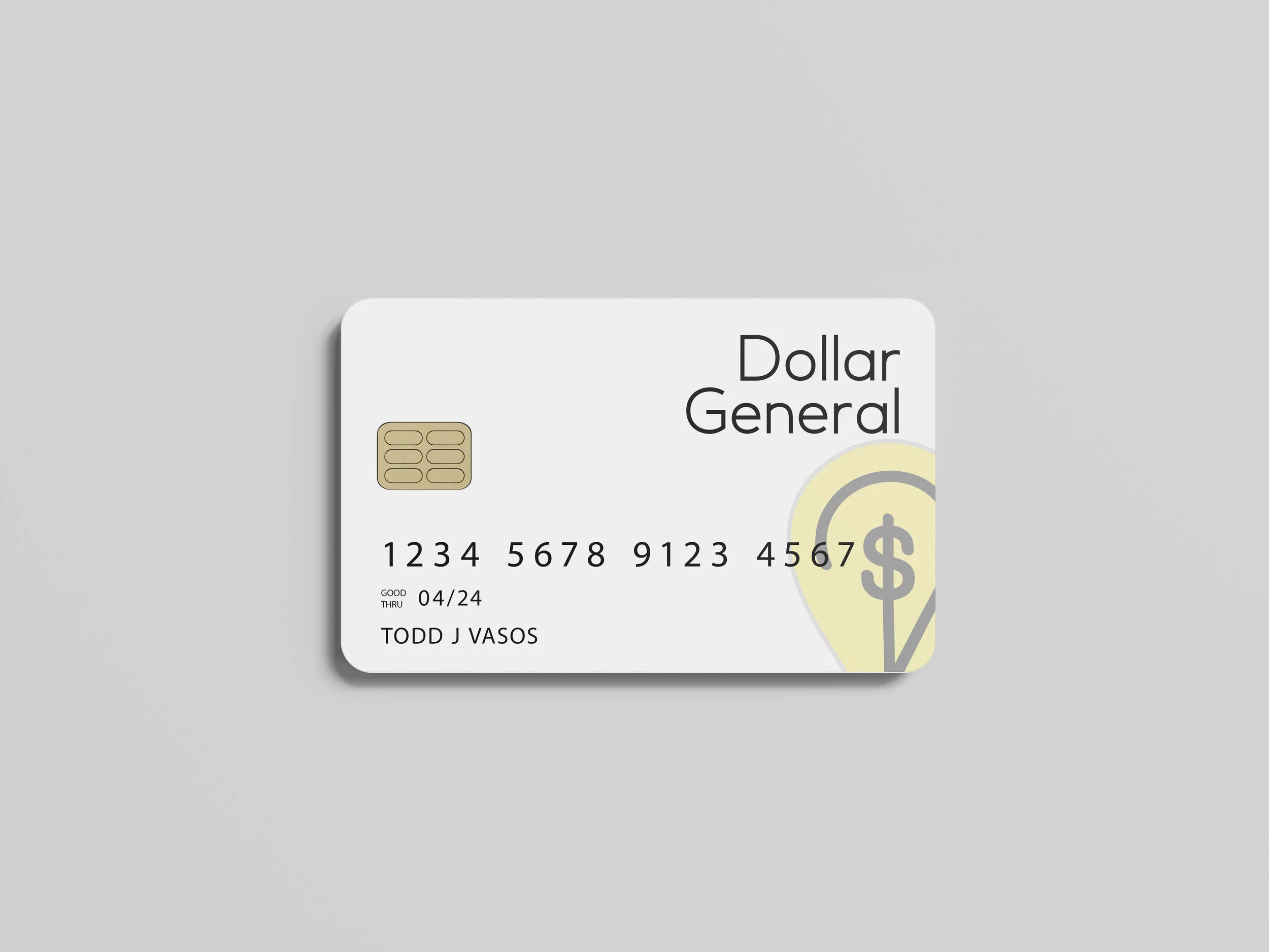
The focus of this project was to rebrand a large company. They chose to rebrand Dollar General. The current logo and overall branding of Dollar General is very dated and quite jarring. Their idea behind the rebrand was to incorporate a similar color scheme but with a more modern aesthetic. In order to achieve this, they created an icon logo and integrated a softer gray color. The text logo is also more modern, they added a sans serif font. This new font is much less harsh, and it is also more approachable. The softer yellow color is less startling. For the stationery, they wanted to keep the logo at the forefront. They have included the logo in multiple places across the stationery. Additionally, there are examples of the new branding on “store brand” products such as chips, lotion, and a store card.